PAYMENT APP FOR MEMORY

PROJECT SUMMARY
Sidekick is a payment app designed as a backup plan for all people and specifically for people with a cognitive difference including ADHD and traumatic brain injury as well as old age where memory is affected. who occasionally forget their wallets and need to pay and have identification for driving or purchasing items where a valid form of identification is required.
PROBLEM STATEMENT
How might we remove friction when people leave their wallets at home?
USERS & AUDIENCE
Its specific niche is people considered neurologically different, with ADHD, brain injury, autism and any cognitively different persons, which may have difficulties with memory.
RESPONSIBILITIES
Qualitative and quantitative research, including competitive analysis, user interviews, and market research.
TIMELINE
Remote, Five weeks of end-to-end design, not including programming.
We changed the timeline during the project to add three weeks to honor capacities in such a design sprint. Oversights were happening based on the sheer volume of work to do, and it was a worthwhile decision.
THE PROCESS
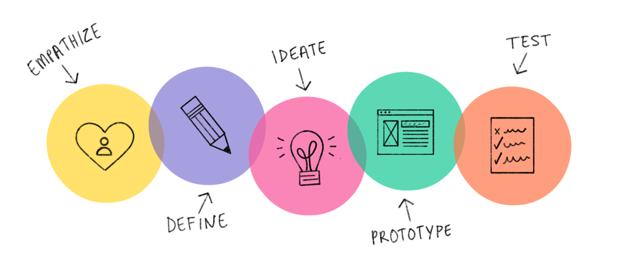
EMPATHIZE
When we began, we had a general idea of what we wanted to uncover. We were curious about how cash-based and person-to-person (P2P) payments have changed with the covid pandemic. We started researching the mobile payment space to learn more about the space. Since we were still in the discovery phase about what problem our product could solve, we came up with a few primary objectives that we hoped to find the answers to.
Objectives
What are barriers to making mobile payments?
What are the pain points people have with payments?
We conducted user interviews to learn more about people’s paying habits in different scenarios. We uncovered an interesting commonality regarding the frustration several users felt when they forgot or misplaced their wallets.
This brought us to further research in the space to uncover more pain points users have regarding payments.

DEFINE
We used our research and the pain points we discovered to brainstorm “How might we” statements. We settled on “How might we remove friction when people leave their wallets at home?”.
After we decided on our direction with a “How might we,” we worked it into a problem statement “The user, who has memory problems, needs a plan b for forgetting their wallet, so they can buy things when they need to”.
We then narrowed it down even more and created a hypothesis statement about our user, the action we need, and its possible outcome. “Our user needs an app to store their payment and identification cards so when they forget their wallet, they can drive and pay for what they need.”
After completing our hypothesis statement, we developed a value proposition by researching other competitors in the payment app space now that we had a more narrowed focus. We wanted to address two points. The first point we considered was why users would care about this product? The second point was inquiring what does our product do? We made a list of all the attributes we would want in our app and then compared them to the direct competitors and found where we could stand apart.
Through our research, we learned that Apple and Google use EMV and NFC signals for payment, which need a newer card reader to pay, making those payment options less widely accepted. Samsung uses a Magnetic Secure Transmission or MST technology, which works with old and new card readers. Any card with a magnetic strip will work with this tech, including an ID card, so our app will allow people to use it universally and allow them to upload their ID so that they can drive without worrying about not having a driver’s license.
IDEATE
We continued to narrow what we were solving by conducting ideation exercises, including crazy 8’s. This is a rapid prototyping technique in which as many ideas as possible are drawn in a set amount of time in multiple rounds. After completing three rounds, we had a scenario involving someone forgetting their wallet while working and being unable to purchase lunch, and being unable to return home to get it.


We continued to rapid sketch with the scenario in mind and then poured over our designs and reworked the best ideas until we had a solid idea.
After we had decided on a favorite idea that made sense with our research and pain points, we worked out a storyboarding that explained the scenario in a more fleshed-out way. We created two storyboards, including the process of setting up an app and the process of logging in to the app and paying.
Knowing we would need to keep our users front and center throughout the design process, we came up with a user persona representing all of our research and relevant interview participants. We named her Brooke, A school teacher who has ADHD. We crafted a story in which she often forgets things when she leaves the house for the day. Her wallet is the most disruptive thing she forgets. We wanted to bring in our how might we and include Brooke.

PROTOTYPE
We had learned in our research that it was essential to have it be easy to use and intuitive for our prototype. Some people with ADHD have difficulties with attention span, so we knew we must design our user experience for speed, intuitive layout, and straightforward function.
We chose to have the option to log in with face ID for simplicity and allow people to create an account with Facebook to further speed the process of creating an account. Our users would also have the opportunity to create an account the traditional way with just a user name and password.
We designed two paths through the prototype for users to test.
TEST
Our target demographic is people with ADHD and neurological differences, so we recruited five users to test our prototype. Each participant was given the context, and we recorded the process on both Zoom for video and otter.ai for a written transcription.
After our user testing, we compiled the insights in an empathy map and noted the recurring insights.
In our prototype, there were concerns about the Facebook login. Three out of 5 of our users were not comfortable linking something financial to another platform for security reasons. We also got feedback that users preferred the carousel layout for cards, unlike the apple pay layout. Several of our interviewees did not understand what set the design apart from Google and Apple pay. Upon hearing the universal payment concept, all users interviewed expressed interest in the app and said they would “absolutely use this app for emergencies!” Because of the confusion, we chose to add the information about universal payments in the high fidelity design for more clarity.
DESIGN
We researched color palettes on many different platforms and researched the best colors psychologically for memory and ADHD. We originally intended to go with the current popular trend of black background and brighter buttons.
After designing several screens, we were not pleased with the esthetic of the app overall. We chose to completely adjust our color theme to be something bright, cheerful, and memorable after getting a stakeholders perspective. We researched tertiary color palettes. We settled on one that we thought would be simplistic, bold, memorable, and still fit our target demographic.
We created our style tile and opted for Poppins as a cheerful and legible font. We had initially decided to go with SF Pro, and since this is an adobe font, we opted for a font in the more widely accessible google font library.

After choosing our colors, we started designing the screens. We changed several things that users had mentioned during user interviews. Removing Facebook and Google, changing the name from Plan B to Sidekick. We made bold choices with buttons to draw attention. The empty states were used to educate the users about the app in place of onboarding which also helped make the app experience efficient and streamlined.
Our persona Brooke was with us during every design choice. We asked ourselves if the decision were something Brooke would use. Neurological differences such as ADHD are not one size fits all, but we knew we needed to keep things simple, elegant, engaging, user friendly, and straightforward.
Most users in our preliminary interviews told us that they were usually on their phones in instances where they forgot their wallets. They were listening to music, talking on the phone, checking social media, or setting up their navigation when getting in a car, making their phone less likely to be forgotten.
With all of our design adjustments and UI components in place in our HiFi prototype, we moved on to test our design with users.
TESTING
Testing
We had users complete the same two paths that we did when testing the wireframes for consistency. We did, however, use different people to test. We asked several follow-up questions.
Was anything surprising or did not perform as expected?
Was the interface complex or easy to understand?
Would you download/use this product if We made the change(s)?
What would you call this app if it didn’t have a name?
We gained so many key insights from user testing. There were several bugs in the prototype that we missed, so the feedback of watching other people go through the product was invaluable. Those bugs were all documented and were the first things to be adjusted.

PRIORITY REVISIONS
Several users also commented that the font color in certain areas was difficult to read or didn’t seem “important” because it wasn’t darker. We changed the color of all fonts to a darker grey for readability and visual hierarchy.
One of our users mentioned a tip line as something valuable depending on what type of business they were purchasing at. We added a link to add a tip but chose not to add an entire tip interaction because not all businesses accept tips.
We had a facebook login feature for users in our original design for ease of use.

We learned that many users opted not linking payment information with social media.
Before, no explanation of the capabilities of the app.

We added information about how users can use the app.

OUTCOMES AND LESSONS
We loved user testing because no matter how complete you think a project is, it can always use polishing, or during testing, User testing brought things to light about how the app could improve or what bugs we might have missed. It is essential to stay receptive and humble, and creating an app from concept to completion is such an excellent lesson in those traits. It was a lot of fun, and next time, we will know how much time to dedicate to specific tasks to avoid burnout.
We had many raving reviews of the concept, our UI design, and the functionality. The following steps are getting it coded and listed on the app store.