E-COMMERCE CHECKOUT PROCESS AND RESPONSIVE WEBSITE

PROJECT SUMMARY
Akasha Wellness has been conducting personal development retreats for seven years, and they have relied heavily on word of mouth for marketing. We were tasked with
Design a responsive website that covers the main functionality of online booking and checkout.
Creating a form field on the checkout page is designed to be intuitive to avoid cart abandonment.
TIMELINE
4 weeks start to finish, including one week of remote usability testing. With a design sprint timeline in mind, we created a task list to reflect the entire project scope to keep us on track with such a short timeframe. We looked up different productivity apps and decided to use Notion for process notes and Asana to track the goals and due dates.
RESPONSIBILITIES
Research, Wireframing, Interaction Design, Visual Design, Copywriting, Branding, prototyping, conducting User Testing.
USERS & AUDIENCE
Men and women age 25-75 who book wellness retreats.
THE PROCESS

EMPATHIZE
Identifying research goals & methods
To understand how people think about booking a trip to a wellness retreat and their thought process, we chose to combine qualitative and quantitative research, including competitive analysis, usability tests, and user interviews.
We wanted to gain insights into the industry, people's motivations for travel, pain points, and how people typically research and purchase wellness retreats online.
Objectives
What are the joys and pain points of booking?
What is important for users when booking?
What is important to users about booking?
Our main goal was to figure out what problem we were solving.
As we commenced with the competitive analysis, we found that Millennials and Baby boomers were the most likely to book a retreat online. They were said to have more of a concern with health and wellness than people in other demographics, which gave us our guideline for user interviews.
We reached out to people on social media between the ages of 20-70 with a previous history of purchasing a trip or retreat online. We asked a series of questions to help us better ascertain the pain points in the resort booking space.
Research Findings
Mental health is the new wellness priority.
Plastic-free policies influence wellness travelers’ decisions.
The Maldives, Bali, and Thailand are the three most desirable destinations.
All-inclusive packages are preferential.
Romance isn’t dead, but corporate retreats might be
Yoga, meditation, fitness, and spa retreats are the most popular types of wellness retreats.
Wellness travelers appear to be indifferent to digital detoxes and no WiFi zones.
Weight loss is not a primary goal for wellness retreat travelers.
Google search, Instagram, and friend referrals are key channels.

DEFINE
The next step in our process was to decide which features we would include. We brainstormed for how might we statement to get clear on what we wanted to solve based on our research findings. How might we create an effortless and intuitive booking process for users?
We used the how might we and brainstormed a problem statement, “How might we create a seamless booking process?”
We began prioritizing our findings and statements and went on to the next step of creating our provisional personas.
Based on the research, we found that Millennials and Baby boomers were the demographics with the highest rate of wellness retreat bookings. We created two provisional personas based on those findings and formulated our assumptions to validate or invalidate during user testing.
We consolidated the findings from our user interviews into two separate personas so that while designing our wireframes, we could keep the user at the forefront of the process.
IDEATE
We continued to narrow what we were solving through ideation. We used rapid brainstorming exercises that would solve the pain point we identified. Users found booking online time-consuming. Some mentioned not trusting certain websites, and others gave up and called the resort on the phone to book.

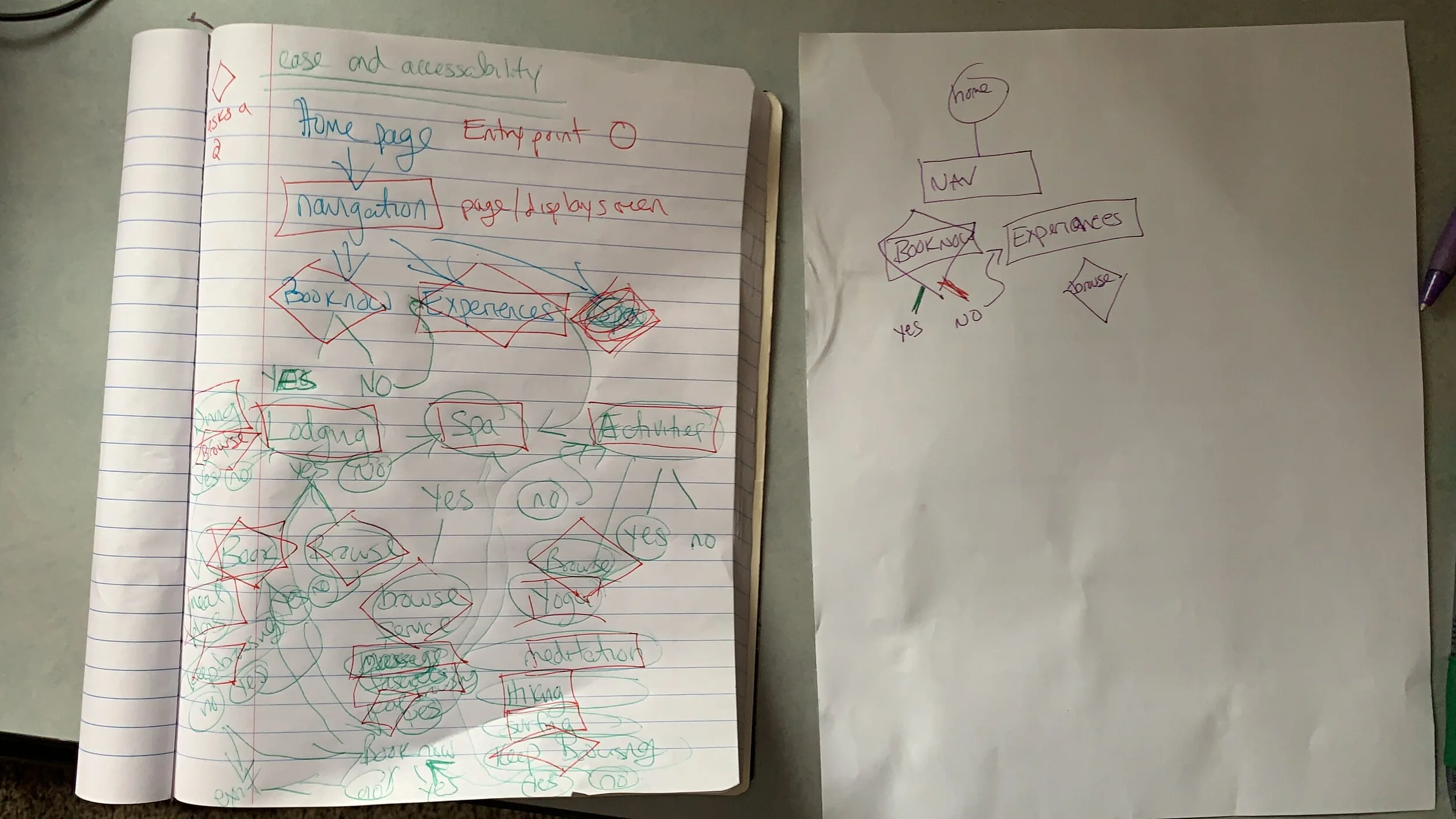
PROTOTYPE
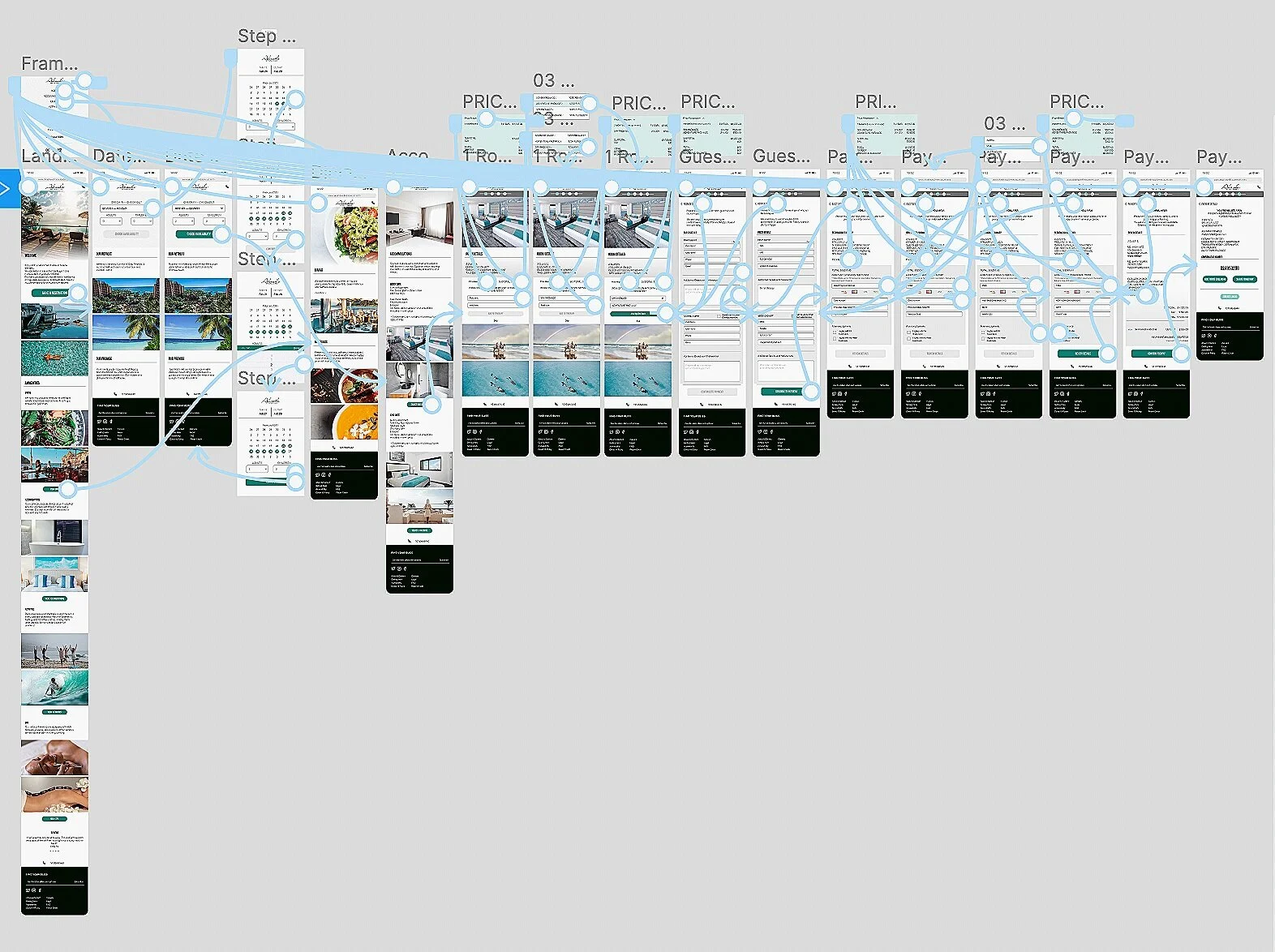
Looking back at the data collected in the discovery phase, we knew that the main desires of our target market were to have the booking process be easy and intuitive, customize a trip, and be able to view dining options for individual diet and health preferences. We created the wireframes with all of those interactions in mind and will test them to make sure our assumptions about the layout being intuitive are correct.

We took what we learned during our initial user interviews and the pages and interactions from the user flow and created a working prototype. Before testing, we received feedback that the prototype lacked context because of too much dummy copy and didn't have the prices in the appropriate places. We made revisions to the prototype with those things in mind before moving on to testing.
TEST
When we conducted, user testing users were able to make it through. However, significant snags illuminated that we needed to make the information displayed during the booking process easier to understand and the full breakdown more intuitive in the price information.
We gained many insights about how to improve the experience for our users, which is exactly what we wanted.
Before User Testing
There was no clear indication of room, dates, or the subtotal for users to reference and verify that the information is correct in our first wireframe. This was an oversight that our user testing brought to our attention.

After User Testing
We added a clear price breakdown available in a collapsible chevron. selections are displayed clearly to avoid user error. A progress indicator was added for users to have a concept of where in the checkout process they are.

Taking from the many insights in user testing, we adjusted the findings, prioritizing those that effected the user experience. These adjustments included adding a better process indicator during checkout, adding a chevron dropdown to view complete price breakdown, and adding an account at the end for easier viewing of the itinerary.
DESIGN
For branding, we referenced the psychology of color. We chose a color theme and font pairing for the site with simple neutral colors with a single green call-to-action color so that the pictures had the most visual hierarchy.
We chose a picture to base our branding on with a range of blacks, whites, grays, and blueish greens. Greens help with calming and instilling a sense of wellbeing. We uploaded elements used in the wireframes, including menus and icons, and chose a few fonts for headings and body copy.
STYLE TILE

LOGO
Inspired by the image we used for our color palette, we wanted our logo to look like ocean waves. We spent time searching for the perfect font using Pinterest and type wolf for inspiration.
Creating the high-fidelity prototype and programming the interactions brought the whole project to life. We could see the color and font combinations with the resort photos to visualize what users would see when going through the process.
We conducted another round of user testing and gained many more insights for our priority revisions. The layout was more intuitive for users. A similar theme regarding the importance of full disclosure around price and logistics to create trust in the product led us to add several more elements for that end.
Before Revisions
The original wireframe included very brief and basic information about the room. There was no price breakdown available for guests to view what they were purchasing.

Under Queen Suite the only available information was the price, but not what was included.
After Revisions
It was important to the users that tested to have thorough information about the room and what was or wasn’t included for clarity and full disclosure in order to establish trust.

After feedback, we added the information about what was included for transparency.
OUTCOMES AND LESSONS
It was fascinating to discover the user’s path through any product, and this is no exception. Users tend not to scroll down a page even when there is a clear affordance, and many did not check dietary information until the end of the process during checkout. It was illuminating to learn what users thought as well as what they needed to feel secure with a booking process,The information that the users needed about the room when purchasing something will help us craft better experiences in the future.
With more time and an unlimited budget, we would love to conduct a third round of user testing with a broader population base to validate the layout and checkout process further.