IX-DR Diagnostic Technology Platform
PROJECT SUMMARY
Digital Diagnostics (DD) is a pioneering AI diagnostics startup that aims to benefit patients by transforming the accessibility, affordability, equity, and quality of global healthcare through the medical diagnosis process.
This project was focused on helping medical technicians learn to use a complex optometry imaging camera to capture usable images. The company’s proprietary technology uses AI to analyze the images and give real-time in. If people with diabetes receive proper care and diagnosis, they can prevent diabetic retinopathy, which causes permanent vision loss in one out of twenty-nine people with diabetes. With proper testing, these patients can prevent this life-altering issue. This project was focused on helping users understand and execute complete, accurate images of the eyes correctly of the eyes.
PROBLEM STATEMENT
“How might we decrease the learning curve and process for medical device onboarding process onboarding processing capture?”
USERS
This UX-DR device is a B2B product, and the primary users are Optometrists and technicians office staff. After foundational research, we created user personas representing each use case.
RESPONSIBILITIES
Qualitative and quantitative research, including competitive analysis, user interviews, and market research.
TIMELINE AND BUDGET
This project involved a fully remote agile team working in two-week sprints. The product manager (PM) and product owners (PO) guided decisions, and the development team was present for daily standups, and biweekly t am touch base. The 3.8 projects spanned six weeks, with additional sprints added for revisions after insights were gained from post-lunch testing. Each phase had a finite budget and timeline. Due to these constraints, many recovery activities and processes were done Adhoc and involved many educational presentations about the design process and why it was valuable.
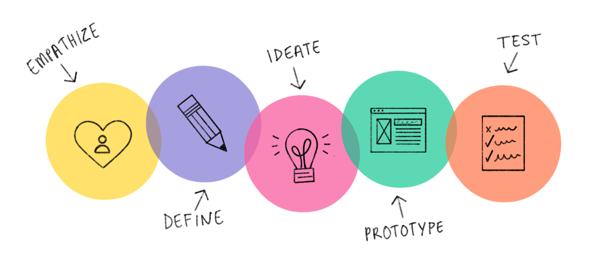
THE PROCESS
EMPATHIZE
There had been data-gathering efforts before UX was brought in. These activities included ethnographic studies, surveys, and user feedback gathered by sales teams and technicians sent to the offices to update the software manually. After receiving the feedback, they reported any information to the product owner, who documented all the learnings in a data repository.
Once the overview of data was analyzed, we scheduled stakeholder interviews to fill in any gaps. And understand the product at a high level. Our goal of understanding the business pain points more thoroughly was to align the goals of business and user experience in the hope that aligning both would create fewer barriers as we came up with potential solutions.
We spent most of our empathize phase analyzing the user journey, watching people walk through the process, and observing which steps caused the most confusion. We documented our findings and created an empathy map with observations.
DEFINE
We used our research and the pain points we discovered to brainstorm “How might we” How might we decrease the learning curve and streamline the onboarding process for medical device image capture??”.
After we decided on our direction with a “How might we,” we worked it into a problem statement “The user, who is new to imaging, needs a step-by-step guide to complete an eye exam quickly.” We also wanted to be sure the business needs were addressed. From the stakeholder interviews, the main issue they had was the limited capacity for support calls, both with hours of operation and the possibility of international support shortly, as well as the budget for staffing. We addressed this in our business hypothesis statement: “The company needs a platform to educate and guide users through the eye exam to decrease the burden on the support team.”
IDEATE
Knowing we would need to keep our users front and center throughout the design process, we created a user persona representing all of our research and relevant interview participants. We used our data to create three user personas. It was brought to our attention that edge cases were common regarding who would be doing the exam. Typically, a trained technician or optometrist would complete the exam from start to finish. However, our preliminary research found that a statistically significant number of front office staff also performed exams. This outlier was due to many factors, including illness and emergencies, and we needed to consider these and create a persona to represent that user group.
PROTOTYPE
We were given access to design concepts created by the product team. With that guidepost, we sketched possible solutions to the pain points we uncovered in our user testing and made an interactive paper prototype to save time and resources.
The designs created by the product team were focused on thoroughly showcasing steps in both text and images to give the user as much information as possible to complete the task successfully. We were instructed to use that framework in our initial mid-fi elite designs. We didn’t anticipate that the lack of visual hierarchy would be adequate for the on-screen instruction to be comprehended intuitively. We immediately mocked up a clickable prototype to test with our users. The previous product manager had a list of steps with very little white space, and the users had difficulty differentiating which to follow. The product manager understood that the amount of information on the screen was problematic and attempted to solve it by adding numbers in the hope of helping the user understand the sequence.
TEST
We performed basic” hallway testing” with coworkers and family due to budget constraints and were able to validate our solution. Our belief that there was excess visual input with all steps displayed gave us the data we needed to propose unorthodox solutions to simplify and streamline.
DESIGN
Without enough visual hierarchy to differentiate which thing the eye should be drawn to first. We designed an A/B version to expedite the process. The designs created were representative of the product team’s approved designs, and the alternate version involved usability best practices. We prioritized Jacob Nielson heuristics by utilizing minor visual adjustments, making sure the Icons were comparable to real-world items, layout for improved hierarchy, color contrast for accessibility and visual hierarchy, Typeface adjustments for legibility and visual hierarchy, adjustments in the copy to clarify the message we were trying to share.
TESTING
Due to time constraints, the team declined the request to test the final design before launch. It was tested post-launch, and the design team hypothesized that there would be a few issues with two screens, and we brought our concerns to the management team during development. The PM made the final call to address them in the next version. The hypothesized issues showed up in the post-launch user testing and were set as a priority for revisions.
OUTCOMES AND LESSONS
The company had only worked with one designer before this project, and much time was spent educating and explaining the UX process and why things were done. This was a fantastic learning experience with cross-functional communication, explaining processes, and developing creative compromise methods. We did this by finding abstract ways to solve problems and find the needed resources. By being resourceful and validating our assumptions, UX slowly gains d credibility. When the results of the testing showed concerns regarding crucial design components, it was a huge step forward in getting the approvals needed to break the mold and try a solution that had been rejected. The progress and earned trust allowed us to get top-down approval for the budget to move forward with professional unmoderated testing through you ertesting.com. It was impactful for the product manager and owners to watch users complete the exam with the training prompts and see firsthand how small changes can be highly impactful regarding layout, hierarchy, and whitespace. Those simple revisions significantly improved our user test findings over the 3.8 final designs. The metrics went from 45% error-free completion to 80%. As designers, we must educate and inform people about the value of the design process. It is a tried and tested guideline that allows us to fail fast and often to save person-hours developing something that won’t solve the business and user problem. This process was an opportunity for learning and growth for all involved, and the result was a more usable product that will help make the world a better place for people affected by diabetes and their families.


